
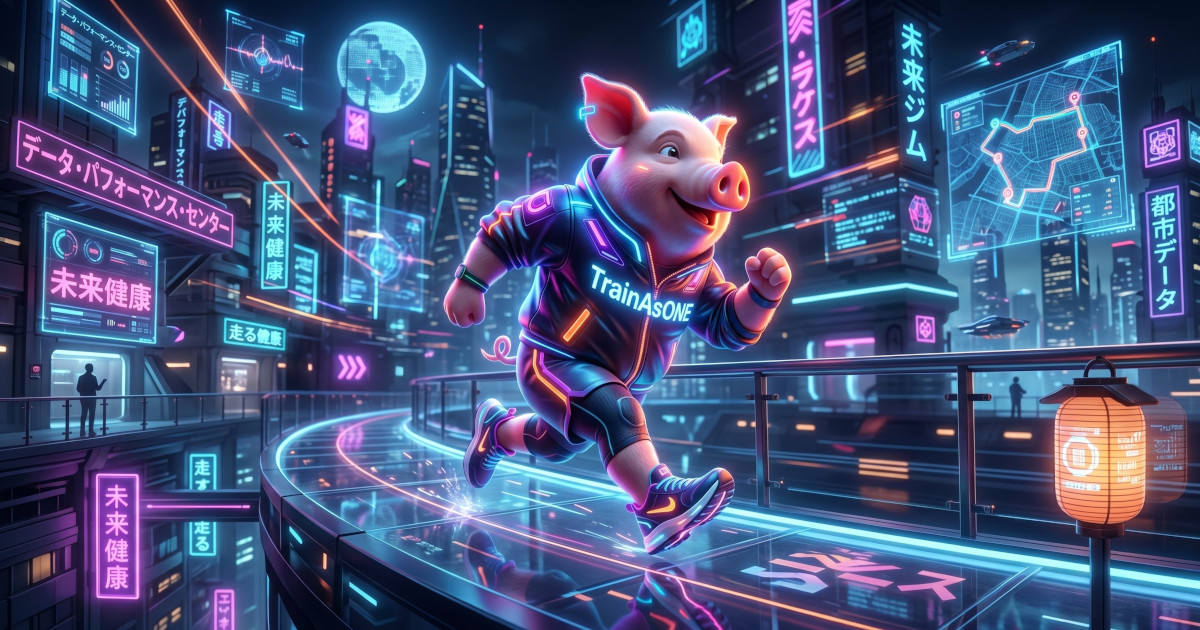
The Pig Gets a Wardrobe: Welcome to the New TrainAsONE Website

One of our users recently described the old TrainAsONE experience as the reverse of "lipstick on a pig". They loved the powerful, industry-leading AI training engine running under the hood, but noted that the interface... well, left a bit to be desired.
We couldn't agree more.
For years, our primary focus has been engineering the smartest, most adaptive running plan generator in the world. But today, we're thrilled to announce that our "pig" is finally getting the snazzy clothes and makeup it deserves.
Welcome to the completely overhauled TrainAsONE website!
What’s New Right Now
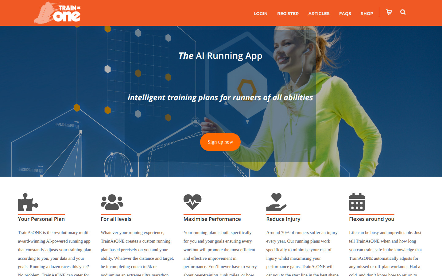
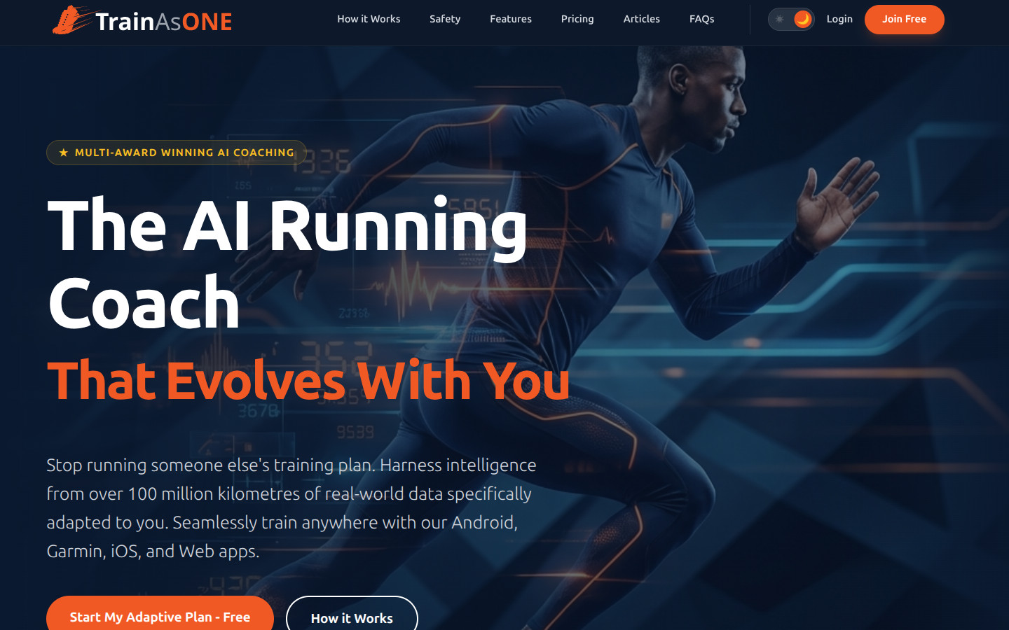
If you've spent any time on the new site, you've probably already noticed the changes. We haven't just added a fresh coat of paint; we've completely rebuilt the platform from the ground up using a modern tech stack.
Here is a quick look at the old design versus the new:
This new architecture brings several immediate benefits to you, our runners:
- Lightning-Fast Page Loads: The new tech stack means pages render almost instantly, making browsing a breeze.
- A Modern, Premium Look: We’ve embraced a sleek, glassmorphic design that reflects the cutting-edge nature of the AI powering our platform.
- Improved Navigation and Search: Finding exactly what you need is now faster and more intuitive.
- A Wealth of New Content: We’ve packed the site with new, highly informative pages, including new articles, expanded FAQs and glossary, and additional support documentation.
Laying the Groundwork for the Apps
While we are incredibly proud of the new website, it is just the beginning. The design language, performance standards, and architectural improvements you see here are laying the visual foundation for something much bigger.
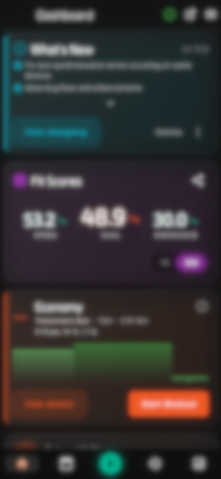
We are currently hard at work bringing this new, premium aesthetic to both the TrainAsONE mobile app and the main web application. Right now, our focus is on establishing this beautiful new UI theme across all our platforms. Once we have the "snazzy new clothes" fitting perfectly, the next phase will be a deep dive into usability — completely overhauling the functionality and adding highly requested new features.
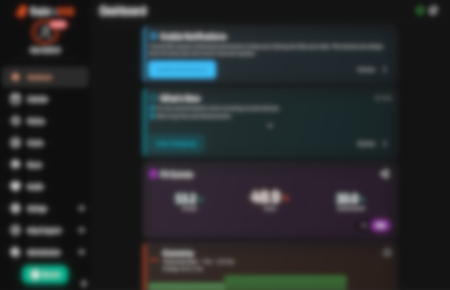
We still have a lot to do and aren't ready to reveal the final functional layouts yet, but here is a blurry sneak peek to give a glimpse of the new vibe and colour palette in action (both shown in our new dark mode, though light mode remains fully supported as a user preference!):
Our ultimate goal is simple: to ensure that the interface you interact with every day is just as intelligent, dynamic, and beautiful as the running plans generated by our AI.
Let Us Know What You Think!
We invite you to explore the new site. Try out the improved search, read through some of the new articles, and get a feel for the new aesthetic.
This overhaul is entirely for you, our community. We'd love to hear your thoughts, feedback, and what you're most excited to see in the upcoming app updates.
Happy running!